

Project Overview

This app was created as a digital resource to help immigrants into their new communities and help them start over in a new country and culture . It focuses on connecting users with local services and resources to help them navigate , assimilate and settle in a new country
BACKGROUND: Immigration Relocation app was designed to help people relocate to a new country, in this case The United States.
Moving to a new country can be a daunting task, especially without reliable information .I relocated to the United states from Africa over 10years ago. From my experience, starting a new life in the United States can be exhilarating and challenging at the same time ,therefore a person preparing to start a new life in a new country needs reliable information to successfully settle down.
My Role: UI/UX Designer and Researcher
What I did:
Research Plan. : Competitive Analysis
User Interviews : Branding /Logo design
Empathy Mapping. : Journey Map,
Persona. : Site Map
User Flow. : Testing
Paper Wireframes. : Digital Wireframes
Low Fidelity Prototype : High Fidelity Prototype
Tools:
Figma Canva Unsplash
The Problem
When new arrivals from other countries come into the United States they don’t know where to start from in terms navigating the system and getting resources . It takes longer to get settled without information/resources { banks, mobility, jobs } .Google information is not structured and its all over the place and overwhelming. Difficult to find community with similar culture and background
Solution
•Create a digital platform with resources and information in one place.
•Have A Virtual Assistant ( to further develop app )
Design Process

Research
Firstly , my research focused on the competition space in order to understand how other apps are addressing similar issues, it was to see if such an app even exist on the market . I found out that the market had a few apps available
Competitive Analysis
The competitive analysis helped me understand the strengths and weaknesses of these apps while finding the market opportunity for ARRIVED App
Some of the available apps :FindHello, HomeIs, SettleIn

Strengths
No need for login and passwords , available as webpage and app.
Home Is covers Canada and USA .
SettleIn though only aimed at refugees , its Easy to use interface and available in 4 languages
Weaknesses
Find Hello: not a lot of direction or help options on the app or page
Not many languages available
Survey : I conducted an online survey via reddit survey to gather quantitative data. below are the survey questons

User Interviews
One -on-one interviews helped me understand users’ journeys and specific issues the app would need to address. I contacted 3 remote interviews and 1 in person interview. I drew my results from Qualitative analysis
Research Findings
•A virtual assistant is needed to guide in navigating the new system & environment
•Only ‘important resources are needed’
•What will stop someone from using google for information- some of the information is vague. Gathering information in an unstructured manner can be overwhelming. It feels like someone trying to hold marbles
•Majority of the interviewees would love to connect with their community to ask questions – for reliable guidance
•Second generation finds it easier to settle because they already have families here
Persona
I created two characters represented by the personas below who represent the client’s target user groups for the app

Primary Persona

Secondary Persona
For a deeper understanding of user behaviors and frustrations influencing decisions I used empathy map.
Empathy Map

I created a journey map based on the insights from user interviews in order to understand the pain points and challenges which users may encounter while.
Journey Map

Once done with the research I started organizing the content
Information Architecture

User Flow
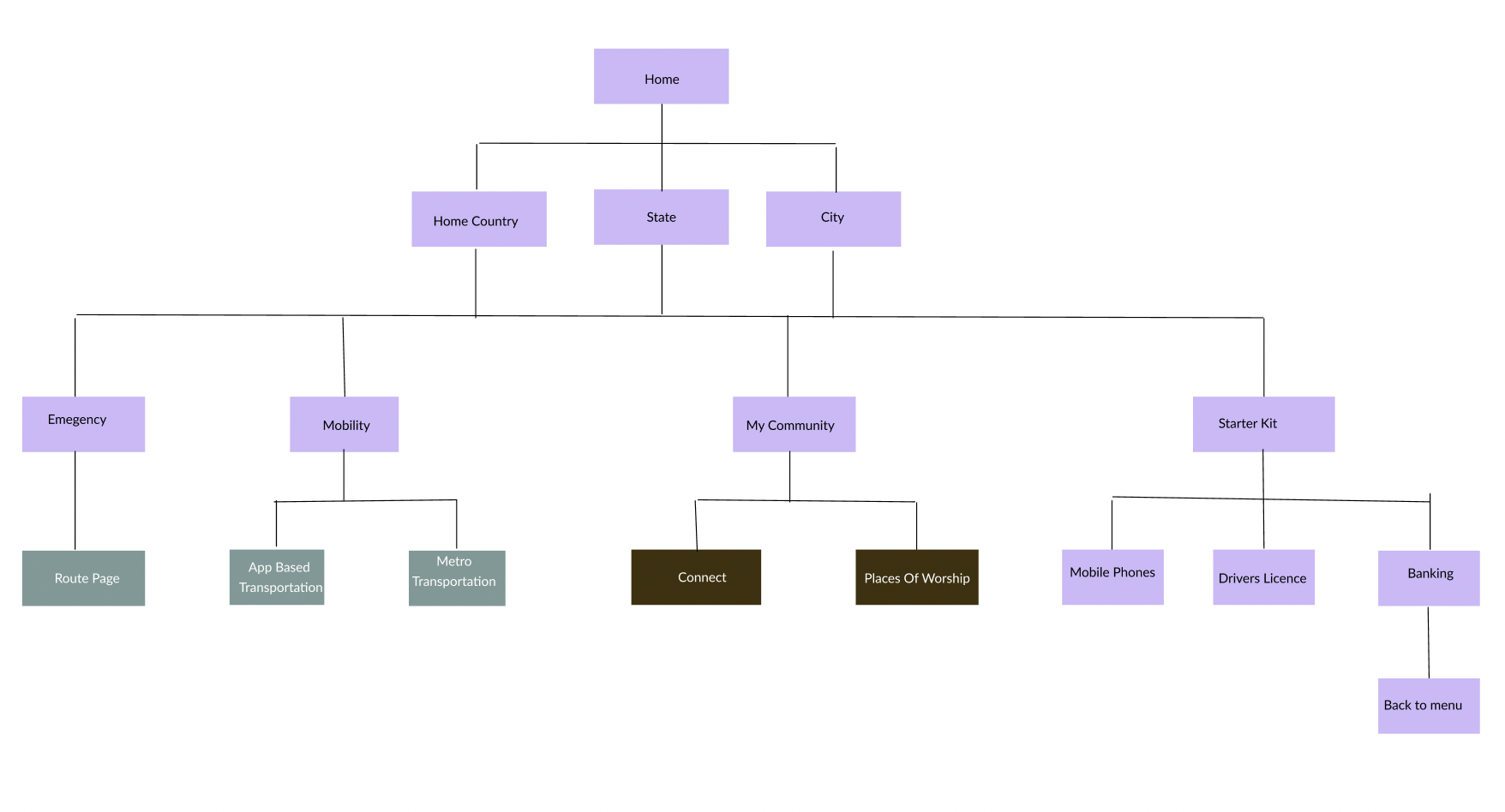
Site Map
I sketched the concept on paper, brainstorming and sketching the frames, the first had lost of ideas however the second one was simplified. Below are the samples
Sketches


I converted the sketches into Lo-Fi Wireframes. usability testing was conducted using the lo-fi wireframes in order to get feedback for iterations
Wireframes

Lo-Fi Wireframes

Hi-Fi Wireframes

Hi-Fi Mockups

Navy blue was used as the main color with tones of bold red and beige and grey to balance the tones
Color Palettes
With prototyping , usability test explained the step by step flow of how the app works and explained the transition and navigation from page to page .
4 tests were done in person. Purpose of the test was explained. Tools for testing: Figma app( Mock ups for test prototype) . Zoom for video communication
Usability Test
Key Takeaways
The red start button is confusing ,remove
Background Images were great -inviting
App is needed in the market , app should be further development
Incorporate different languages to cater for a more users
Include virtual assistant feature as app is further developed

Prototype
Simplified sketch